Zeitcaster
Event Discovery Experience
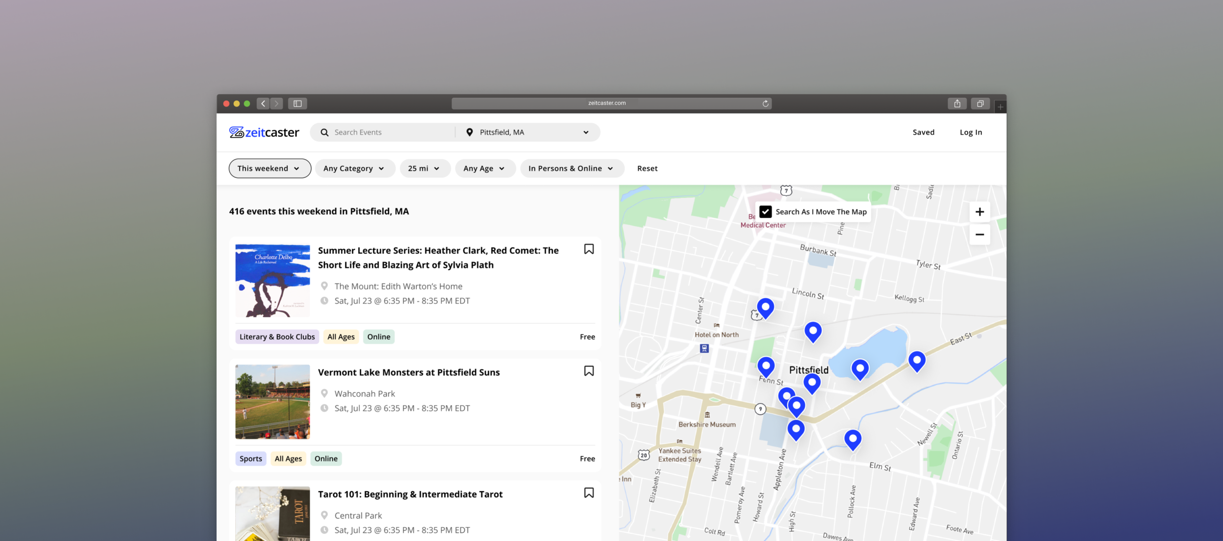
Zeitcaster is a library of events for people who want to find activities to do with family and friends.
The library is curated with a comprehensive list of events collected by editors from the local community and is inclusive of all groups.
The project is a continuation of our winning entry in the UX Result Hackathon. We were hired by Zeitcaster to redesign their product.
My Role
Our team conducted research and hold design review sessions together to deliver high-quality work. We are each responsible for designing one part of the project and providing constructive feedback for all.
During this project, I worked closely with Zeitcaster stakeholders and users to define goals and validate concepts. In addition, I collaborated with Zeitcaster’s development team to implement my designs and provided design QA support until the launch.
In the span of 200 hours, I crafted a delightful event discovery experience through in-depth research, prototyping, and usability testing. I also initiated and designed the style guide and pattern library to ensure consistency and scalability of the product.
Full Project Scope↓
Category
Freelance
Duration
Feb-Jul. 2021
~ 200hr
Team
Designer team of 4
Developer team of 5
Role
UI/UX Design
User Research
Journey Mapping
Wireframing
Interaction Design
Design Systems
Design QA
Tools
Figma, Notion, Slack, Github
Impact after launching phase 1
35.57%↑
Pageviews
101.69%↑
Average Session Duration
5.1%↑
Returning Users

Project Quickview
Problem Before Redesign
People who have a family need to find meaningful events to do with their family and friends. Zeitcaster collected thousands of relevant events yet users cannot narrow down their choices.
Users found the filters barely usable nor visible, which could leave them navigating overly broad event lists.
Solution Quickview
In order to quickly narrow down options, users can use keyword search, browse map, or view similar events based on organizer or category.
Key User Journey:
Search/Filter/Map → Select and Learn more about the event →More Similar Events.
Search
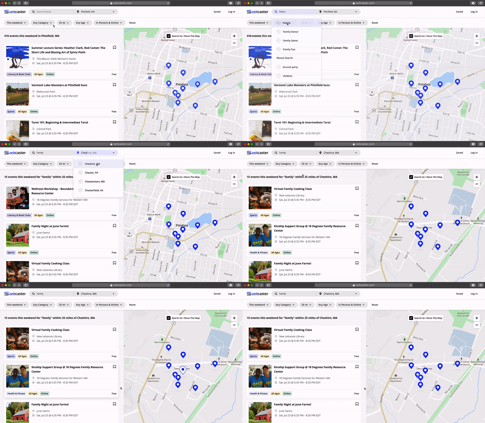
Added keyword search and location search are prominent on global navigation, helping users to navigate the site.
Filter
A horizontal filter bar shows the users the context of their search results and allows users to understand the range of the events Zeitcaster is covering.
Map
While hovering on the card, the pin on the map will highlight the location. While clicking on the pin, a thumbnail of the event will pop up.
Interaction
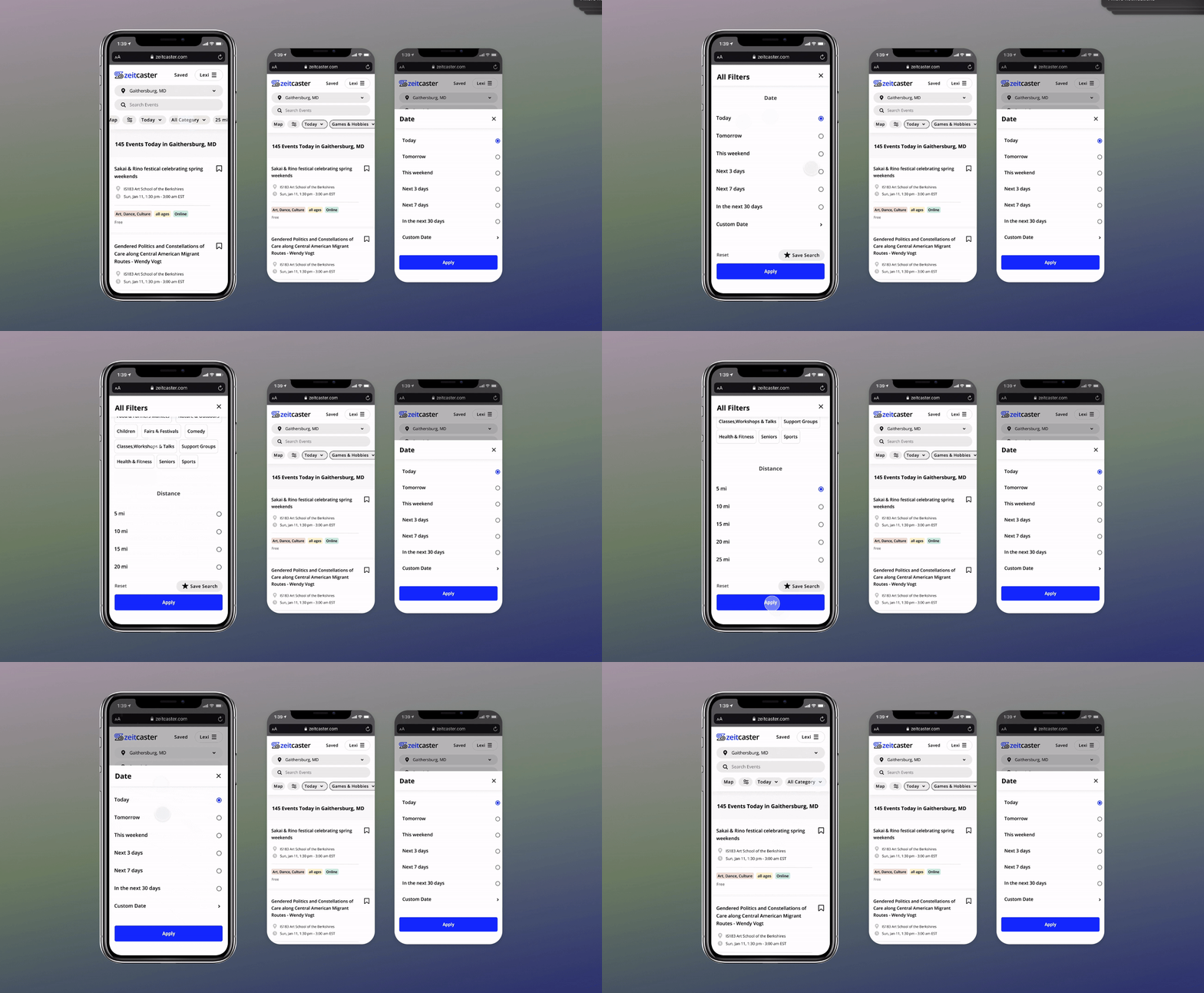
I added interactive details, different states, fixed positions, etc., to optimize the experience, emphasizing often-used functions and improving clarity.
Understand
Business Metrics
To kick-off, Our team met with Zeitcaster’s stakeholders for a series of QA sessions to learn about their current project goals.
Since there are more new users than returning users now, the priorities are activation and retention. The metrics we are looking at are Page Views, Average Session Duration, and Returning Users.
Research Methods
Our team conducted different types of research to achieve different goals at the beginning of the project and during the project. I drafted series of survey and user interview questions, planned the usability studies, and conducted benchmark analysis.
User
Using the insights I gathered, I began to synthesize and develop user profiles highlighting user’s needs and goals and then created user stories to understand the major scenarios.
Key Journey Mapping
I synthesized through mapping the research findings into the key user journey map of the event discovery experience.
Insights
Define How Might We
01/ How to help returning users come back to their last discovery?
02/ How to helps users understand what kind of events are collected here?
03/ How to design for users who need to select many filters?
04/ How to design a friendly and useful no result page?
Ideation
I hosted brainstorm sessions to explore possible solutions for each how might we. We then voted on solutions according to the business value, user value, and technical difficulties.
Conception
I wireframed iteratively to define the information architecture of screens. I also explored various navigation approaches to determine the best experience for the user.
I collaborated with Zeitcaster’s stakeholders and users along the way to validate concepts and gather feedback to continue improving the experience.
Key Design Decisions
Key design decision
Feature: Do users need a Keyword search field?
“Is keyword search necessary?”
The client is inclined not to include a search field because it is not developed yet. It can be an investment because it might need recent searches, auto-complete, auto-suggest, and tagging the events when entering event data.
I convinced the client from two perspectives.
For Users:
First click test finding: Search is intuitive. It can be the fastest route to discovery.
Usability test finding: Supporting users’ ability to return to an event previously found or heard of from friends.
Survey: Half of the users think search is the most important feature.
For Business:
Giving users a feeling of breadth or depth of the site's selection
Search allows us to learn about the users' needs. It tells us what they're looking for and we can optimize the website so that it delivers relevant information to users.
Key design decision
Layout: Top filter vs. Side filter?
Traditionally filters are positioned on the left.
During benchmark research, we found most sites with similar functions have left-sided filters. However, widely used design patterns aren’t necessarily the best pattern for all products.
I selected the top filter for the following reasons:
Help users better aware of their options
The top filter bar is easier to discover.Encourage users to utilize the filters.
Users frequently overlook the sidebar, which could leave them navigating overly broad event lists.Convenient and efficient
Baymard’s study shows that a top filter bar significantly outperforms the left-sided one in terms of convenience and efficiency when there are few filter options.Leave more space for events and the map.
Iterations for the search and filter
I explored different ways to lay out the search and filters. Collected feedback from the client, the team, and the users.
- Improve consistency
- Increase visual hierarchy
- Remove unnecessary elements
- Focus on the most valuable features
Key design decision
Interaction: Batch Filters vs. Interactive Filters?
“Why not always refresh reacting to users’ every selection? It can show them how their actions are impacting the results. “
Solution:
Interactive filter for single choice
Batch filter for multiple choice.
Batch filtering saves users time between requests.
Skeleton Screens
Provide feedback about what is to come
helping the time to fly by a bit more quickly.
Key design decision
Edge Cases: What if there is no result?
Users outside of MA could find the dropdown list disappointing.
Even if they can input their location, it is very likely to turn to no result.
Alternative solution:
Explore online events. *The time zone shown in the event card will also match the users’ time zone.
*Different messages and call to actions for different user input
Responsive Design
Style Guide
I established a flexible design system that includes visual styles, components, and a set of guidelines for usage. The design system not only improved efficiency during the design process but also ensured the platform could continue to evolve and maintain visual consistency.
The design system provided Zeitcaster's internal design and development teams with a toolkit of styles and elements which they could utilize when iterating on new features in the feature.
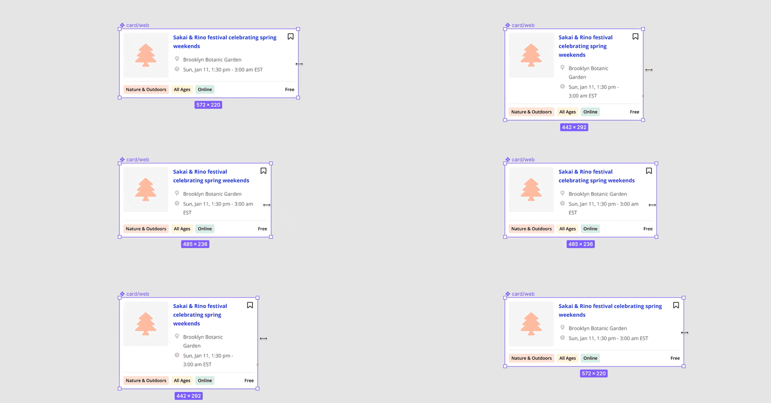
Responsive components
Learnings
The launch of the phase 1 was a success, and stakeholders were excited about the solution. I also learnt a lot about the real design process, product management, collaboration and communication skills.
Preparation makes perfect | Always prepare plenty to support my idea.
Teamwork is everything | Communication and collaboration are more than 50% of the work.
Constantly testing | There isn’t a stage too late to do user research.
Initiate to take responsibilities | The more initiatives I take, the more responsibilities I take, the more I learn through the process.
View more projects ↓


