Freelance
Experience Design
Visual Design
2020.07-08
Keru Website Redesign - Help students apply to summer volunteer programs
Overview
Keru is an educational organization that offers high school students opportunities to participate in volunteer programs. Our team worked with them to redesign their website, helping students learn about and apply for programs through its website.
Our Team: Coii, Yihan, Yilin, Celine, Liz, Qingyi
My Role: We collaboratively researched, brainstormed, formed concepts, and finalized the wireframes. I was responsible for the refinement, UI, and final delivery.
Problem
Thousands of students who were referred by their schools or friends open the Keru website looking for a program to join. However, only 2 of them applied through the website.
Solution Quickview
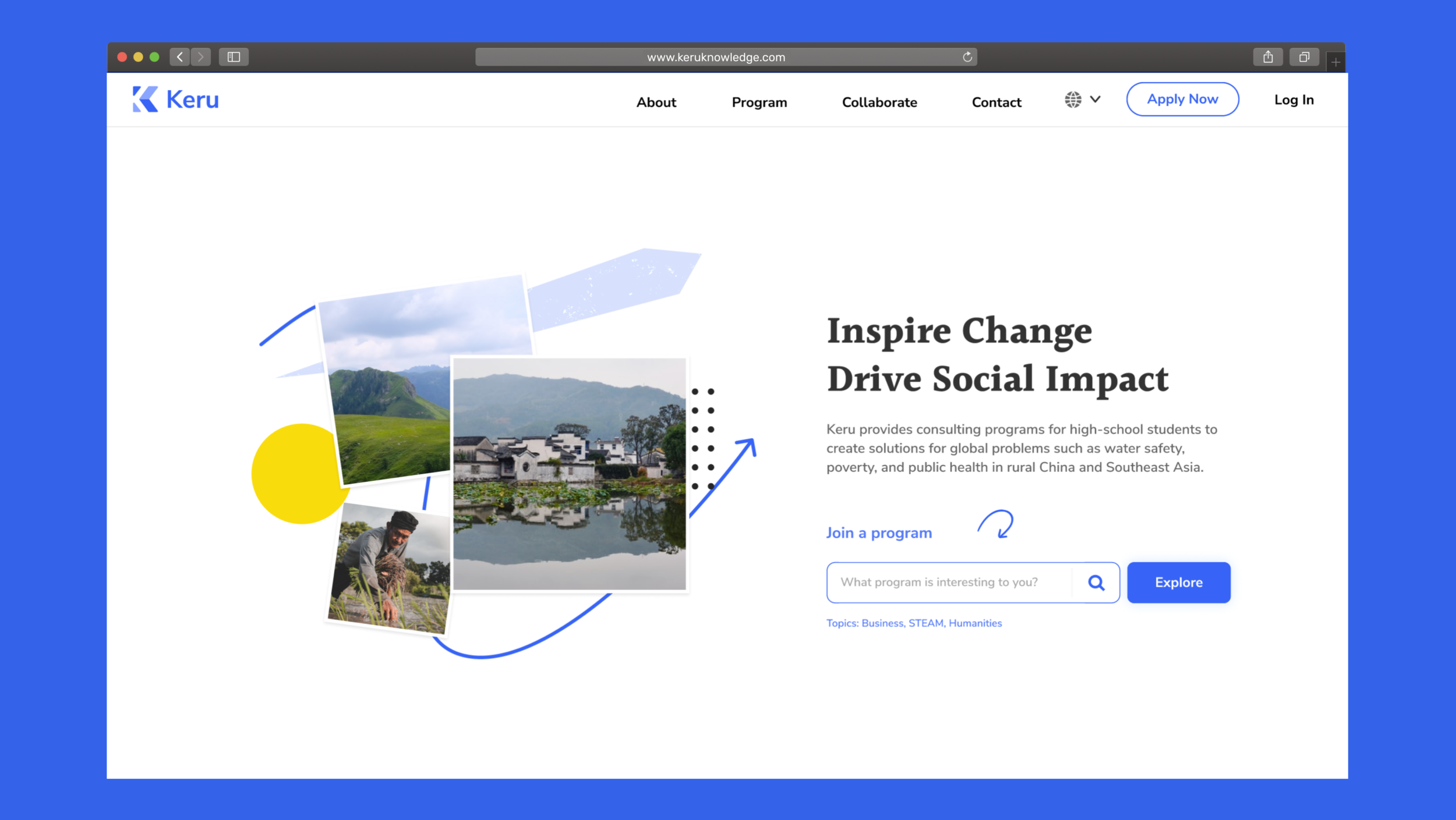
We redesigned the website to help students easily learn about Keru and the programs and also apply to them through the website without talking to a consultant.
Build Trust
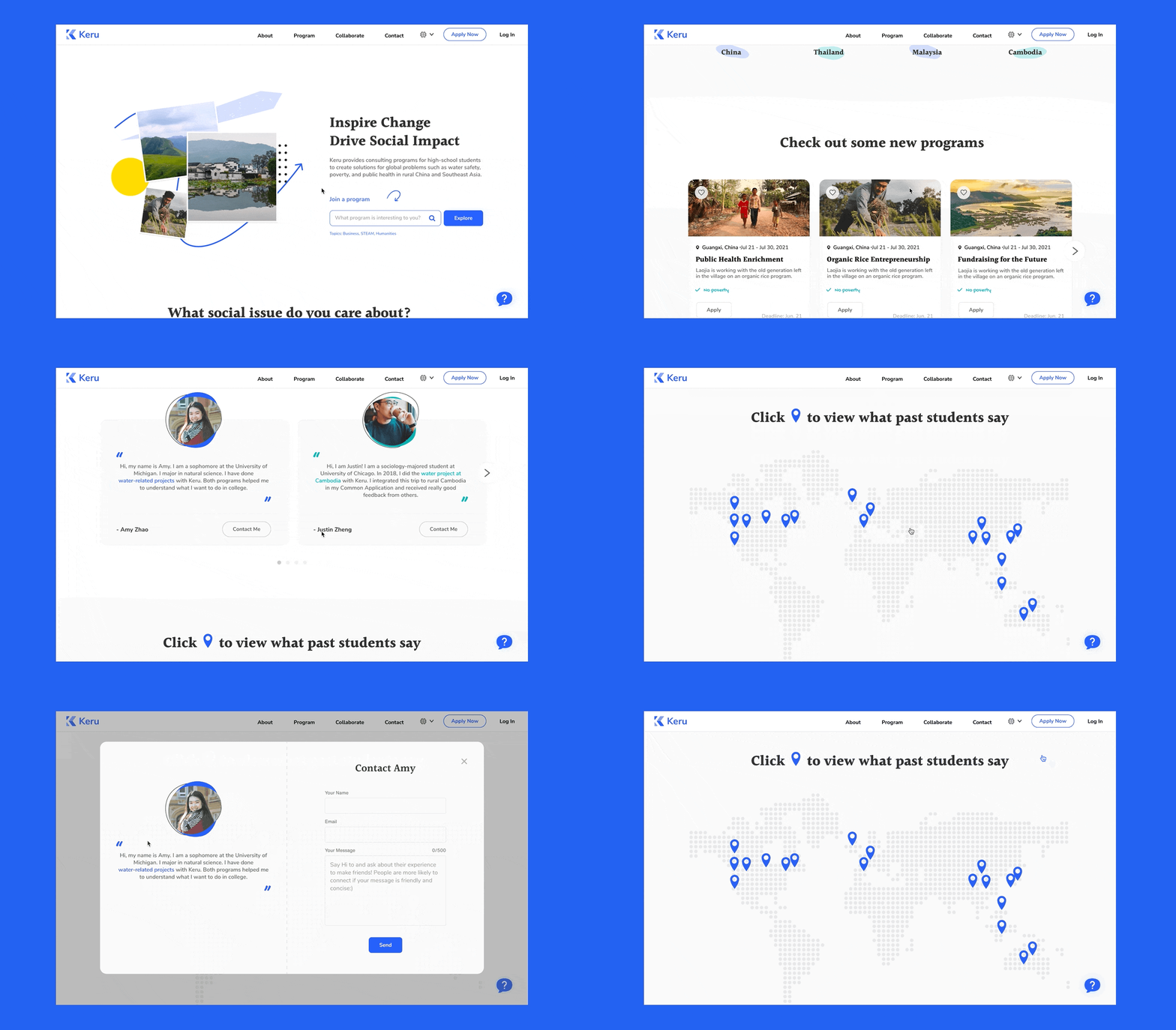
Map view helps students to understand the short bios of Keru’s past students and also allows them to contact alumnus to learn more about Keru and its programs.
Browse and save programs
We learned from user research that students most likely need more than 2 weeks to make the decision to join a program. Considering that scenario, we designed the save feature for students to go back to revisit their last selections.
Learn about the program
Organized, comprehensive, and transparent details about the program allow students to make well-informed decisions.
Apply to the program
Frictionless application flow allowing users to apply with friends. Fixed floating box adding clarity to the application process.
Process >>>>>>>>>>
Research
Understand Context
We talked to the marketing manager to understand the users and the business goal.
1.How are students applying to Keru’s programs now if not through their website?
Students mainly referred by their friends or schools, they contact Keru through the Wechat official account. Most students would chat with their consultants through Wechat to learn about Keru and its programs. If they decided to apply, the consultant would send them the application form.
2.Why do they want students to apply online?
Keru was building up collaboration with more schools worldwide, so they have an increasing number of students who contacted them asking for information. They wanted to transform most of their labor-intensive work into the new website.
3. Who are the target users?
Most users are referred, but they have different levels of understanding about Keru and its programs. Some of them have already learned about the programs from brochures sent out by schools while others only know a little about Keru.
User Research
Interview & Contextual inquiries
We interviewed 8 participants, including potential students and their parents. We also conducted contextual inquiries with them.
Goal:
What do users need from the website?
What are the factors influencing their decisions on whether to apply or not?
What are some frustrations when they are using the website?
Insights
Problem 1 / Lack of Credibility
Websites must establish trust and present themselves as credible to turn visitors into customers. However, all of the students we interviewed told us that they didn't feel like the website itself was trustworthy. Some of them even doubt the credibility of Keru as an educational organization.
Problem 2 / Frictions in the Application Flow
Even though students trust the website and the organization, there are still many frictions on their way to apply.
They cannot find the application entrance.
They cannot apply with friends, which is important because students are under 18 and often prefer to travel with a friend.
A lot of fields in the form are confusing.
Ideation
We collaboratively brainstormed and organized them into different scenarios. Then the ideas are evaluated based on three criteria: 1. Trustworthiness, 2. Informative, 3. Clarity.
Wireframe
We sketched low-fi wireframes to lay out the structure and use mid-fi wireframes to map out the flow.
Iteration
We constantly comparing different design patterns and make iterations for testing.
*Design decisions
Problem 1 : Lack of Credibility
Websites must establish trust and present themselves as credible to turn visitors into customers.
However, all of the students we interviewed told us that they didn't feel like the website itself was trustworthy. Some of them even doubt the credibility of Keru as an educational organization.
Solution: 5 ways to build credibility
In 1999 Jakob Nielsen listed 4 ways in which a website can communicate trustworthiness: design quality, up-front disclosure, comprehensive and current content, and connection to the rest of the web. Source
We found his principles very much aligned with our interview findings. The students mainly doubt the website because of it’s
Poor design quality: Site navigation is confusing, and the visual design looks outdated
Lack of transparency in the application process
Limited and outdated content
*Students didn’t reflect any concerns about the last principle, “connection to the rest of the web.”
All above are the ways to increase the credibility of the website itself, and we also found some specific factors influencing the credibility of Keru:
4. The scale of the organization
5. The words from Keru’s alumnus
Design Quality
1.1. Improve the Site Navigation with Clarity
There are two types of students coming to the site for different information. The first type of student wants to view detailed program information while other students have already received a brochure including all program information from their school or friends. They are looking for the application entrance. However, the current design labeled program search page - “Student”-confused all of our interviewed students and parents. With this category name, they cannot determine whether the content they are looking for, detailed information of programs, or the application form, exists on the site.
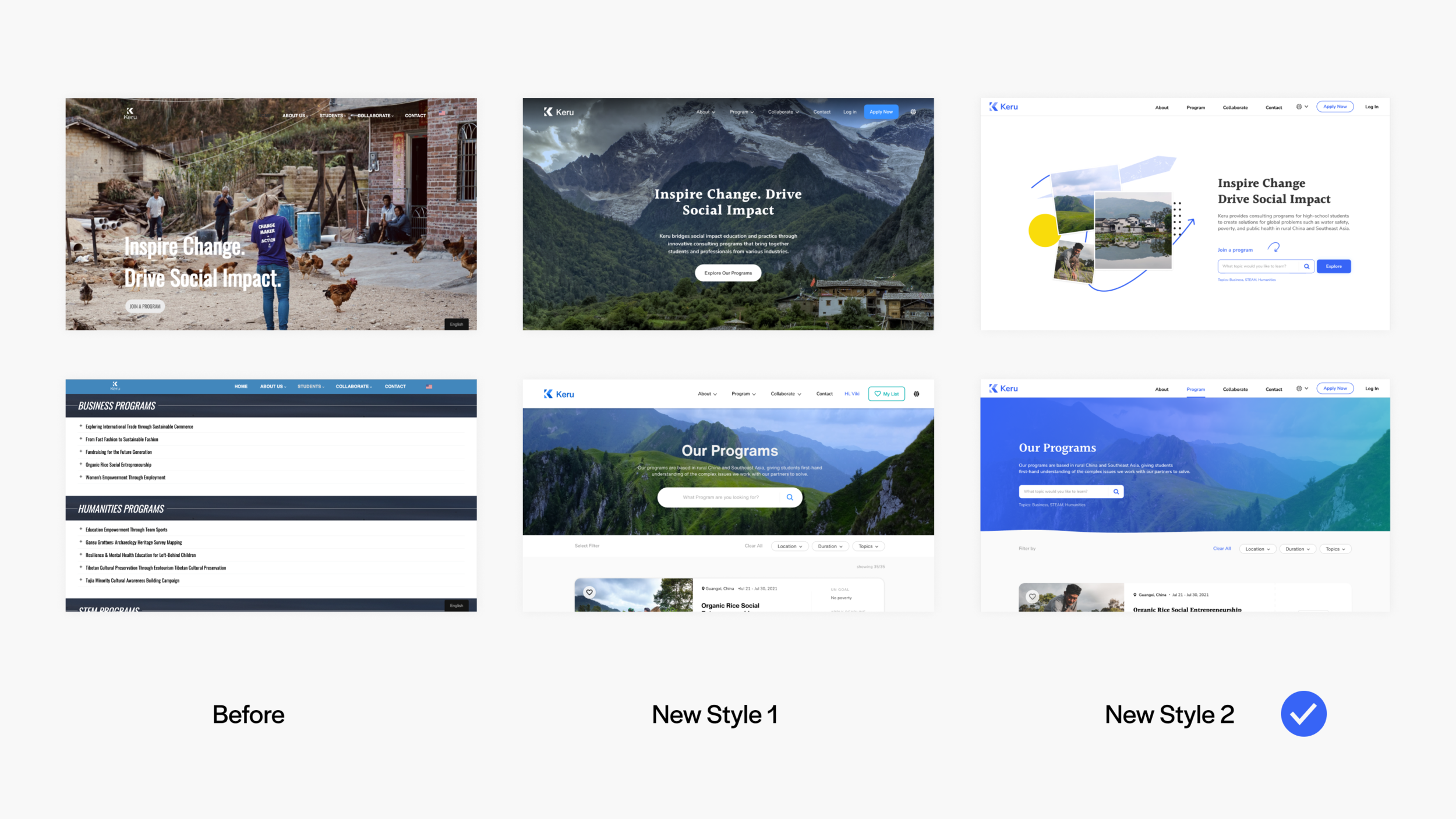
1.2. Visual Design - Up to Date
We ended up doing a rebrand and a new style guide for Keru. We did two styles for students and parents to choose from. All of the students and most of the parents selected the flat design because they consider the website that responds to trends looks more up to date and international.
2. Improve Transparency
Progressively disclose the information
Users reflected that the application process is lacking transparency. They don’t know what would happen after sending the application. Keru’s marketing manager told us the reason they didn’t show a full explanation of the process considering users would likely turn away because of the complexity. We design it in a progressive way so users would be able to learn about the necessary amount of information at different stages.
3. Improve content
3.1. Comprehensive Content
Thorough information related to the service exudes expertise and authority. In our interview, students and parents appreciated sites that contained a large amount of relevant information related to programs because it showed that the organization was well informed and committed to helping them decide. We found parents were especially looking for information about where their kids going to be every single day. We worked with Keru to confirmed the information that going to be displayed on the program detail page.
3.2. Current Content
A “Check out some new programs” section to imply the contents on this site are up to date.
4. Scale
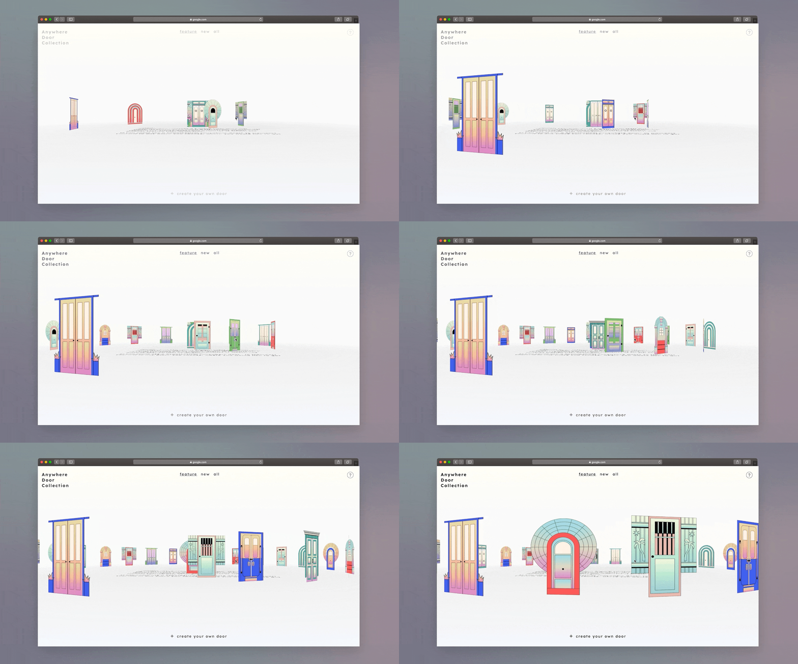
Show the scale of the organization
Students and parents both mentioned that they trust the organization on a larger scale. How might we design in a way that shows Keru’s advantages in terms of scale?
Comparing different Solutions:
The Design
5. Learn about Keru from its alumnus
Students reflected that they would trust the words from Keru’s alumnus. Also through talking with alumni, they can learn more unnoticed details about programs.
PART2:
Frictionless Application Flow
During the user research, we found that students usually spend more than 2 weeks deciding if they are going to apply or not. They might need to come back to the site multiple times at any stage.
What we did for part 1, building up trust is just the very beginning of keeping the users. The second part is about how we fulfill the needs during the whole application process before the user submits the application.
On any page, students might be in different stages, so they need to be able to find the application entrance anywhere on the site.
During the contextual inquiries, we found many students couldn’t even find the apply button, because:
It is on the bottom of the student page.
Many students missed the apply button because it doesn’t look like one.
We provided multiple apply buttons on every page in a prominent position so that students can start an application anywhere on the site.
Save
Students can also save programs to their list so they can later revisit their selections to discuss with their family or friends.
Also, we know that new users are most likely not starting an application on their first visit, we can also measure success by the save action.
Apply Together
While filling up the information, students can add their friends, so Keru can group their applications together.
During the later process, Keru can assign the same consultant for them to save some communication costs. Students can also share information and discuss it during the process.
Takeaways
1/ User research isn't the only way to understand the users
Since in this project, we are mostly working with the marketing team, we found that it is very insightful to look through their point of view.
2/ Context is the key.
The client first comes to us just asking for a website redesign which too big a project in a limited time. In order to find the most urgent issue and define the scope, we did a few rounds of Q&As with our client. Finally, together, we defined the problem and the project scope. It is a good starting point and also halfway to their satisfaction with our final delivery.
More Projects ↓


